Afini
Graduation project
2025
Afini is a mobile game app that helps young adults learn the basics of money through short games instead of lessons. I designed it on my own, from the first idea through research, testing, branding and a high-fidelity prototype.
Role
UI/UX Designer and Brand Designer
Timeline
January – April 2025
Team
Solo graduation project
Platform
Mobile app (iOS prototype)
Overview
Afini turns credit, savings and interest into swipe cards, real-life scenarios, flashcards and quizzes. Users choose how to begin, learn at their own pace, and gain enough confidence to make better money decisions, with or without the app.
The Impact
10
Interviews
interviews with students, finance students, consultants and organisations
3
User Tests
rounds of user testing that reshaped the games and onboarding
4
Game modes
game modes, each built for a different way of learning
Problem
Setting up the motion sensors was complicated, repetitive and easy to get wrong. Athletes couldn't tell which sensor went on which joint, or whether the setup had worked. Wrong placement produced inaccurate data, which skewed progress tracking and left physiotherapists unable to help without being there in person.
01
Placement guesswork
Identical-looking sensors gave athletes no clue which joint each one belonged to.
02
No confirmation
Nothing told athletes whether the setup was correct, so errors went unnoticed until the data looked wrong.
03
Remote care breaks down
With unreliable data, physiotherapists had to step in live, which defeated the point of remote therapy.
Research
Before I joined, the team had interviewed athletes and physiotherapists to validate the idea. I used their notes to understand the users' pain points, and filled the gaps with my own research in articles and forums about remote rehabilitation.
Team interviews
Athletes and physiotherapists, used to shape early ideas.
Desk research
Articles and forums on remote rehab.
Design audit
The dev team's first screens, reviewed for consistency and priority.
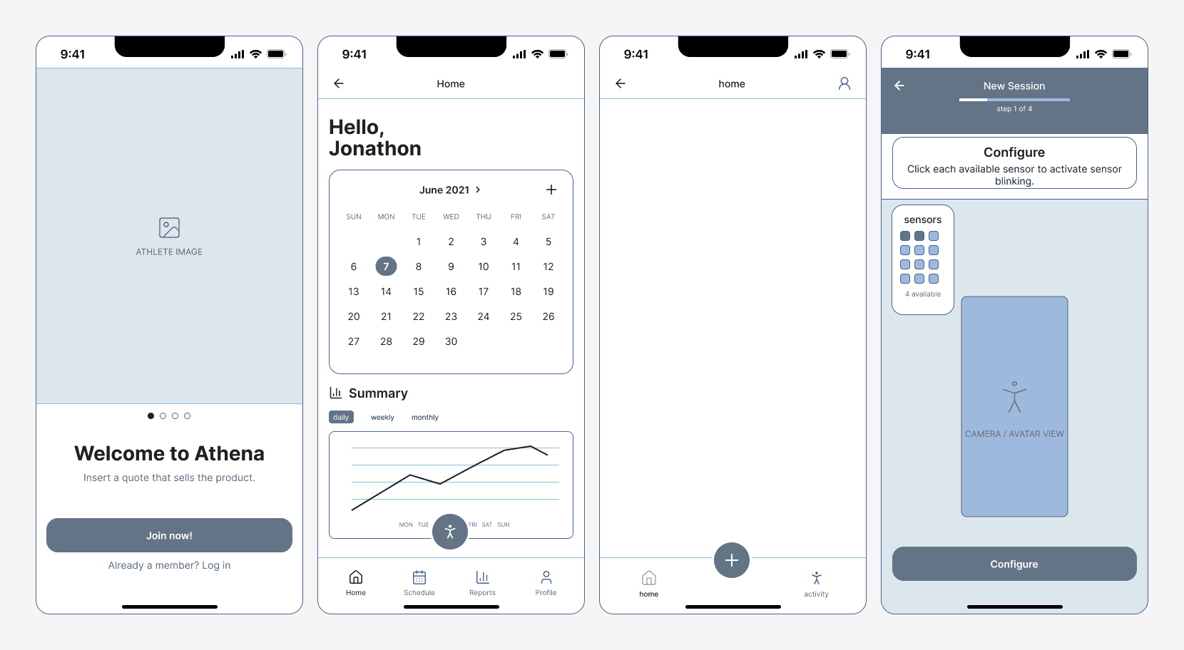
The first screens weren't organized around what mattered most.
The development team had already created some early designs. When I analyzed them, I found inconsistent visuals and an information architecture that didn't put the most important information first. I rebuilt the IA for registration and the core features, ordering each screen by what athletes needed in the moment.
Key insights
Setup is the moment of truth. If athletes can't place the sensors correctly, nothing after that can be trusted.
Athletes need proof, not instructions. Seeing their movement confirmed on screen builds more confidence than any written guide.
The athlete comes first in the app. Physiotherapists work from their own web platform, so the app shouldn't try to serve both.
Physiotherapists need data they can trust. Without reliable readings, remote sessions fall back on live supervision.
How might we help athletes set up sensors correctly and use their digital twin for feedback, while giving physiotherapists reliable data to guide recovery remotely?
Design direction
How Athena works: one loop from sensor to therapist
Each sensor is matched to a joint and attached. A live digital twin shows the movement on screen, the app records every exercise without manual logging, and the data syncs to a web platform where physiotherapists give feedback and assign the next session.

1
Match & attach
Each sensor is paired to a joint and attached.

5
Assign next session
The therapist sets what comes next, and the loop restarts.
Every session feeds the next
2
Live digital twin
The movement mirrors on screen in real time.


4
Physio feedback
Physiotherapists review the data and give feedback.
Syncs to the web platform

3
Auto-record
Every exercise is logged, with no manual entry.
Patient app
Therapist web platform
Ideation
I sketched, wireframed and researched different ways to visualize movement and progress, so the client could compare options before we committed. Over 30 wireframes covered onboarding, session tracking and sensor setup, refined through usability feedback, CEO reviews and close work with developers on technical feasibility.
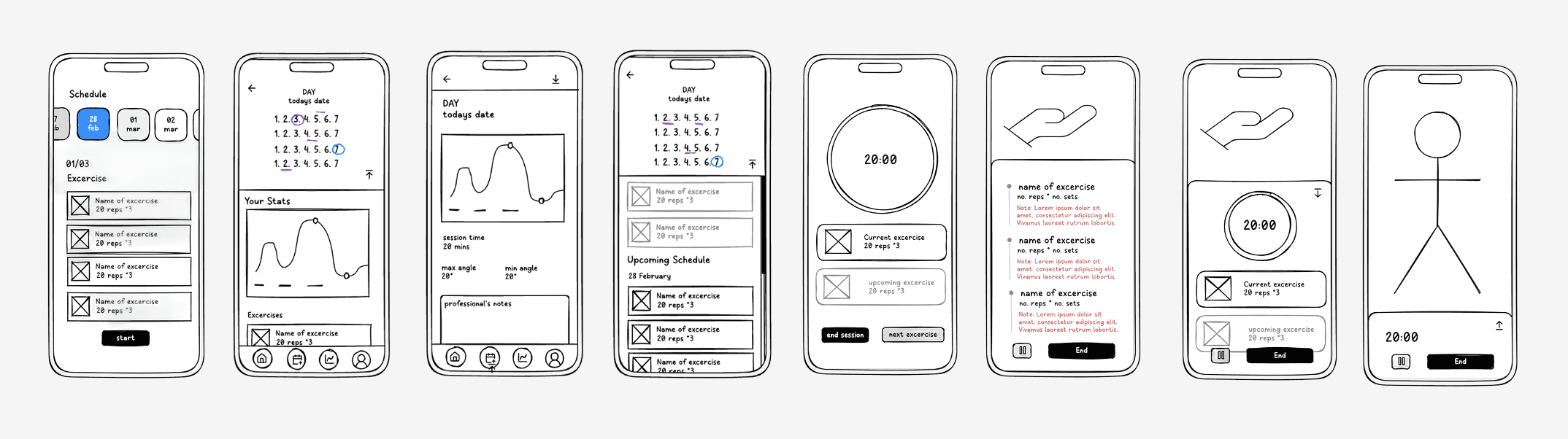
Early explorations of charts, calendars and session views for motion and progress data.
01
Setup with minimal input
Setup flows that ask for as little as possible and do the rest automatically.
02
Clear feedback
Every step confirms what just happened, so athletes never have to guess.
03
Data that invites comparison
Visualizations that make progress, and differences between sides of the body, easy to read.
Solutions
Four decisions that made remote setup reliable. Each one addresses a problem from research, from placement guesswork to unreliable data.
Sensors light up to show where they go.
During first-time setup, athletes choose a body part and the matching sensor flashes, so there's no guesswork. The setup is saved for future sessions, so athletes only do it once and the data stays correctly mapped.
A live digital twin confirms the setup and the movement.
Real-time 3D feedback shows athletes that the sensors are placed correctly and that they're doing the exercise right. This builds trust and means physiotherapists don't need to step in as often.

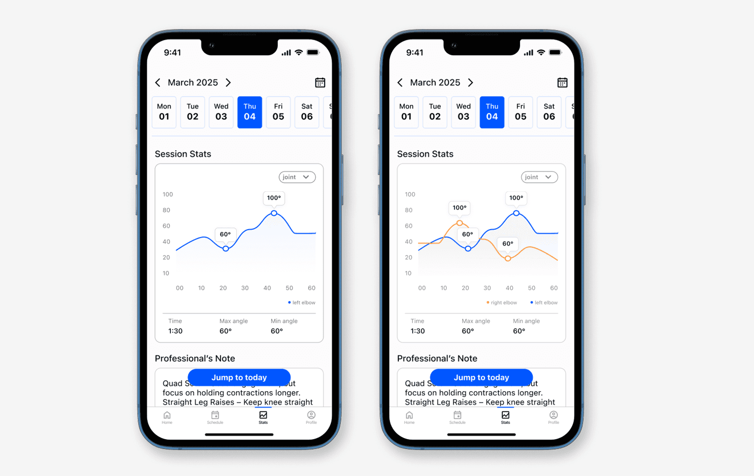
Automatic progress graphs let athletes check their own form.
After each session, athletes see their stats and their physiotherapist's feedback. Feedback showed they wanted to compare left and right joints, so graphs show both sides together or one at a time.
A design system covers every sensor and connection state.
I built a component library from scratch for complex states like Bluetooth pairing, low battery and streaming errors. It standardized type, colour-coded statuses and interactions, which cut repetitive work and made developer handoff reliable.

Potential impact
Less supervision
Automatic tracking frees physiotherapists to focus on analysis and treatment plans.
More motivation
Visual progress and personal notes keep athletes accountable throughout rehab.
Better recovery
Real-time feedback and accurate data help athletes fix their form and stay consistent.
Wider access
Guided sessions at home reduce the need for clinic visits, especially in remote areas.
Lessons
This project meant designing for first-time users, hardware limits and a product that was still taking shape. The biggest lesson was to watch how people really handle the device and design around that, not around how we hoped they would use it.
What I’d tell my future self
Design around real behaviour.
Watch people use the hardware before deciding how the software should guide them.
Build for the MVP, stay flexible.
Solve today's needs while leaving room for changing requirements.
Show options to align faster.
Presenting several data visualizations helped the client decide what mattered.


